3 ways to create an outstanding landing page
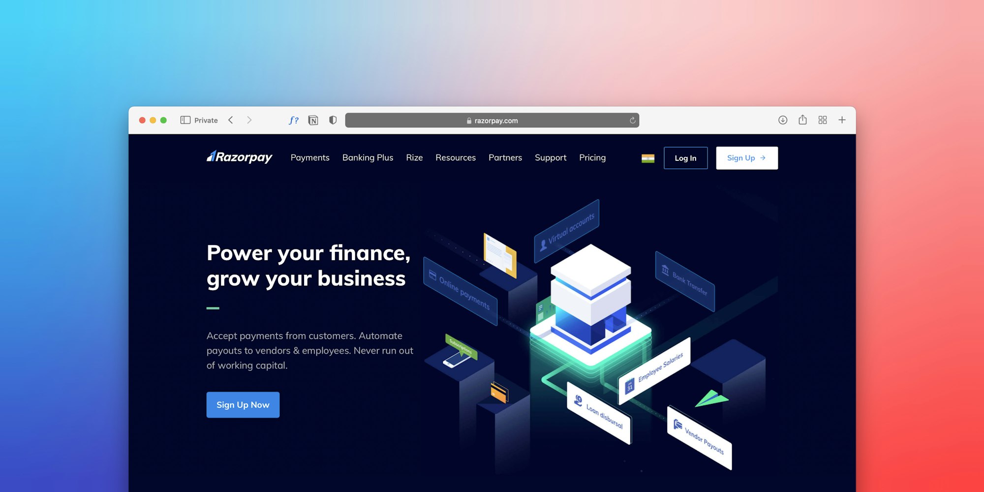
Make your landing page attractive and easy to navigate. A focus on compelling visuals, calls to action, and key message placement is a big part of success.

An awesome landing page is essential to drive traffic, turn visitors into customers, and build your brand. It’s usually a standalone page, distinct from any other page, where you offer up all the key information about your business in return for contact info or direct customer signups.
Great landing pages convert because they are simple, persuasive, and clearly facilitate a single business objective with one or more clickable calls-to-action ('get started,' sign up,' 'learn more,' etc)
With ever-increasing competition for customer attention, it is important to make your landing page attractive and easy to navigate.
Here are three tips on how to make your landing page stand out and convert visitors into qualified business leads.
Use great visuals rather than text walls

Too much text on a landing page can turn people away. Instead of overloading a page with text that users most likely don’t have time to read, focus on telling your story with visuals.
A creative and delightful background image is a proven way to grab the user’s attention. Paying attention to the color pallet and using appropriate color gradients is great way to make the design eye-catching.
Sometimes, brands have a complex concept they need to convey on their landing pages. In these cases, it can be tempting to go text-heavy. But with a wide range of free design tools available, try experimenting with infographics, visualize your data, or use fun videos to engage with busy audiences.

Try multiple calls to action

It is common to have one call-to-action (CTA), such as 'subscribe' or 'register' at the bottom of the page. But experimenting with multiple CTAs may increase your chances of success, especially when a customer is eager to learn more about the product.
You can try buttons and forms with various wordings, such as 'book an appointment,' 'sign up for free,' or 'send me a special offer' to see what works best.
According to a case study by Invesp, multiple CTAs can lead to a double-digit increase in your conversion rate. That said, striking a balance is key and it’s important to not overdo this (three or four CTAs on a single page should be more than enough).
In the end, it should be easy for visitors to convert on different parts of the page, but they shouldn't feel as if they're being pushed with too many commands.

Focus on the first part of the page

In the traditional media industry, priority headlines go on top of the page to grab more views. The same applies to marketing.
Placing your key message right at the top increases the chances of connecting with visitors. You can also choose to put your CTA right at the top rather than at the bottom.
Whatever you do, just remember that simplicity is key. Keep your landing page focused on giving customers what they want, without overloading it with too much info or lengthy forms to complete.
Save time and money when creating and distributing high-quality press releases. ContentGrow's platform serves up the best freelance professionals to bolster global comms teams. Sign up to get your campaign started.


